自定义组件
您可以轻松地自定义一个 Material-UI 组件的外观。
有多种方法可以实现在不同的上下文环境中使用组件。 从最狭窄的用例到最广泛的用例,这些是:
- 一次性使用的特定变体
- 一次性使用的动态变体
- 在不同环境中使用组件的 特定变体
- 材料设计变体 例如按钮组件
- 全局化主题变体
1。 一次性使用的特定变体
您可能需要为特定实现更改组件的样式,您可以使用以下解决方案:
用类名覆盖样式
覆盖组件样式的第一种方法是使用类名 。 每个组件都提供className,它是一个始终应用于根元素的属性。
此示例使用withStyles()高阶组件将自定义样式注入DOM,并通过它的classes属性将class名称传递给 ClassNames 组件。 您可以选择任何其他的样式解决方案或甚至简单的CSS创建的样式,但一定要 考虑 CSS注入顺序 ,当通过Material-UI将CSS注入DOM对组件进行样式化, 这些CSS将具有最高的优先级,因为<link>被注入到<head /> 的底部以确保组件始终能被正确地渲染。
用类覆盖样式
当className时属性不够用,你需要访问更深层的元素,你可以利用classes 对象属性,来自定义该组件中所有由Material-UI注入的CSS。
The list of classes for each component is documented in the component API page, you should refer to the CSS section and rule name column. 例如,您可以查看 Button CSS API 。 或者,您可以使用浏览器中的 devtools 。
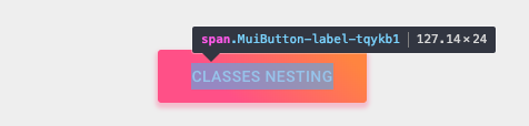
这个例子也使用了 withStyles() (见上文),但在这里, ClassesNesting 使用 Button 的 classes 属性来接收一个对象,该对象将 要覆盖的classes子项名 (样式规则)映射到 对应的CSS属性名称 (值)。 组件的现有类将继续被注入,因此只需要提供你想要添加或覆盖的特定样式。
请注意,除按钮样式外,按钮标签的大小写也已更改:
<Button
  classes={{
    root: classes.root, // class name, e.g. `classes-nesting-root-x`
    label: classes.label, // class name, e.g. `classes-nesting-label-x`
  }}
>
  classes nesting
</Button>
Overriding styles with global class names
使用开发工具
使用浏览器中的devtools可以为您节省大量时间。 在开发环境中:Material-UI的class名称遵循一个简单的模式: Mui [组件名称] - [样式规则名称] -[UUID] 。
让我们回到上面的演示。 你是如何能覆盖按钮标签的?
使用开发工具,您知道需要定位 按钮 组件和 标签 样式规则:
<Button classes={{ label: 'my-class-name' }} />Shorthand
上面的代码示例可以通过使用相同的CSS API作为子组件被固定。 在此示例中, withStyles() 高阶分量正在注入由 Button 组件使用的 classes 属性。
const StyledButton = withStyles({
  root: {
    background: 'linear-gradient(45deg, #FE6B8B 30%, #FF8E53 90%)',
    borderRadius: 3,
    border: 0,
    color: 'white',
    height: 48,
    padding: '0 30px',
    boxShadow: '0 3px 5px 2px rgba(255, 105, 135, .3)',
  },
  label: {
    textTransform: 'capitalize',
  },
})(Button);<StyledButton>classes shorthand</StyledButton>
伪类
组件特殊状态,如* hover * ,* focus * ,* disabled 和 selected * ,具有更高的CSS特异性。 特异性是一种重量这适用于给定的CSS声明。
为了覆盖组件的特殊状态,需要提高特异性 。 下面是一个示例,其中 disabled 状态,按钮组件使用 伪类 (disabled):
.Button {
  color: black;
}
.Button:disabled { /* Increase the specificity */
  color: white;
}<Button disabled className="Button">有时,您不能使用伪类,因为该平台中不存在该状态。 我们以菜单项组件和 selected 状态为例。 除了访问嵌套元素之外,还有classes 属性可用于自定义Material-UI组件的特殊状态:
.MenuItem {
  color: black;
}
.MenuItem.selected { /* Increase the specificity */
  color: blue;
}<MenuItem selected classes={{ root: 'MenuItem', selected: 'selected' }}>为什么我需要增加特异性以覆盖一个组件状态?
通过设计,CSS规范使伪类增加了特异性。 为了保持一致性,Material-UI增加了其自定义伪类的特异性。 这有一个重要的优点,它允许您挑选您想要自定义的状态。
我可以使用不同API吗?这样会需要更少样板。
您可以基于由Material-UI生成的全局类名,而不是为classes提供 prop API的值。 它实现了所有这些自定义伪类:
| classes键 | 全局类名 |
|---|---|
| checked | Mui-checked |
| disabled | Mui-disabled |
| error | Mui-error |
| focused | Mui-focused |
| focusVisible | Mui-focusVisible |
| required | Mui-required |
| expanded | Mui-expanded |
| selected | Mui-selected |
.MenuItem {
  color: black;
}
.MenuItem.Mui-selected { /* Increase the specificity */
  color: blue;
}<MenuItem selected className="MenuItem">在同一样式表中,使用 $ruleName 引用本地规则
The jss-nested plugin (available by default) can make the process of increasing specificity easier.
const styles = {
  root: {
    '&$disabled': {
      color: 'white',
    },
  },
  disabled: {},
};
会编译为:
.root-x.disable-x {
  color: white;
}⚠️您需要将两个生成的类名称(root & disabled)应用于DOM以使其工作。
<Button
  disabled
  classes={{
    root: classes.root, // class name, e.g. `root-x`
    disabled: classes.disabled, // class name, e.g. `disabled-x`
  }}
><Button
disabled
classes={{
root: classes.root, // class name, e.g. `root-x`
disabled: classes.disabled, // class name, e.g. `disabled-x`
}}
>
classes state
</Button>
<Button style={style}>inline-style</Button>
<React.Fragment>
  <FormControlLabel
    control={
      <Switch
        checked={color === 'blue'}
        onChange={handleChange}
        color="primary"
        value="dynamic-class-name"
      />
    }
    label="Blue"
  />
  <StyledButton color={color}>Dynamic CSS</StyledButton>
</React.Fragment>
<React.Fragment>
  <FormControlLabel
    control={
      <Switch
        checked={color === blue}
        onChange={handleChange}
        color="primary"
        value="dynamic-class-name"
      />
    }
    label="Blue"
  />
  <Button className={classes.button} style={color}>
    {'CSS variables'}
  </Button>
</React.Fragment>
3。 在不同环境中使用组件的特定变体
您可能需要创建组件的变体并在不同的上下文中使用它,例如产品页面上的彩色按钮,但是您可能希望保持代码* DRY * 。
最好的方法是遵循选项1,然后通过导出自定义组件来利用React的组合功能,以便在任何需要的地方使用。
<ClassNames>Component</ClassNames>
4、 Material Design 变体
Material Design规范记录了某些组件的不同变体,例如按钮的形状如何不同:text (以前称为“flat”),contained (以前称为“raised”), FAB 或者更多。
Material-UI尝试实现所有这些变体。 请参阅支持的组件文档,找出您想要的所有支持的Material Design组件的当前状态。
5、 全局化主题变体
为了提高组件之间的一致性,并整体化管理用户界面外观,Material-UI提供了一种应用全局更改的机制。
本节的示例介绍了如何更改按钮的字体大小。
Theme variables
You can adjust the theme configuration variables.
const theme = createMuiTheme({
  typography: {
    button: {
      fontSize: '1rem',
    },
  },
});<ThemeProvider theme={theme}>
<Button>font-size: 1rem</Button>
</ThemeProvider>
全局CSS覆盖
您还可以使用CSS自定义组件的所有实例。 Components expose global class names to enable this. 它与您自定义Bootstrap的方式非常相似。
const GlobalCss = withStyles({
  // @global由jss-plugin-global处理。
  '@global': {
    //如果嵌套主题,则应该定位[class * =“MuiButton-root”]。
    '.MuiButton-root': {
      fontSize: '1rem',
    },
  },
})(() => null);

// …

<GlobalCss /><React.Fragment>
<GlobalCss />
<Button>font-size: 1rem</Button>
</React.Fragment>
全局主题覆盖
您可以利用可被覆盖的主题的键,这样可以改变由Material-UI注入的每个单独样式。 在主题部分可以了解有关它的更多信息。
const theme = createMuiTheme({
  overrides: {
    MuiButton: {
      root: {
        fontSize: '1rem',
      },
    },
  },
});<ThemeProvider theme={theme}>
<Button>font-size: 1rem</Button>
</ThemeProvider>