Color 颜色
颜色承载了不同的寓意。 开箱即用,您可以查看 Material Design 规范中的所有颜色。
使用 Material Design 的颜色系统,您可创建表现独特品牌或风格的颜色主题。
颜色系统
一些重要的术语
"调色板(Palette)"
一个调色板是颜色合集,譬如即色调和它们的阴影。 Material-UI 涵盖了 Material Design 指南中的所有颜色。 设计此调色板时,我们确保了各个颜色之间的协调。
“色彩”和“阴影”
调色板中的单色由一个诸如“红色”的色调,以及一个诸如“500”的阴影调和而成。 “red 50”是红色的最浅的一度 (* 粉红色! *),而“red 900”是最暗的。 除此之外,大多数的色调都带有以 A 为前缀的强调(accent)色调。
例子
Material Design 调色板包括主要(primary)和强调(accent)颜色,它们可用于展示或开发您的品牌颜色。 它们彼此可以协调地呈现。
例如,您可以参考互补主要颜色(complementary primary)和强调(accent)颜色(例如“red 500”和“purple A200”):
import purple from '@material-ui/core/colors/purple';
import red from '@material-ui/core/colors/red';

const primary = red[500]; // #F44336
const accent = purple['A200']; // #E040FB
const accent = purple.A200; // #E040FB (替代方法)
调色板
若给定了一种色调(如红色,粉红色等)以及一个阴影 (500,600等),你可以这样导入颜色:
import HUE from '@material-ui/core/colors/HUE';

const color = HUE[SHADE];- red500#f44336
- 50#ffebee
- 100#ffcdd2
- 200#ef9a9a
- 300#e57373
- 400#ef5350
- 500#f44336
- 600#e53935
- 700#d32f2f
- 800#c62828
- 900#b71c1c
- A100#ff8a80
- A200#ff5252
- A400#ff1744
- A700#d50000
- pink500#e91e63
- 50#fce4ec
- 100#f8bbd0
- 200#f48fb1
- 300#f06292
- 400#ec407a
- 500#e91e63
- 600#d81b60
- 700#c2185b
- 800#ad1457
- 900#880e4f
- A100#ff80ab
- A200#ff4081
- A400#f50057
- A700#c51162
- purple500#9c27b0
- 50#f3e5f5
- 100#e1bee7
- 200#ce93d8
- 300#ba68c8
- 400#ab47bc
- 500#9c27b0
- 600#8e24aa
- 700#7b1fa2
- 800#6a1b9a
- 900#4a148c
- A100#ea80fc
- A200#e040fb
- A400#d500f9
- A700#aa00ff
- deepPurple500#673ab7
- 50#ede7f6
- 100#d1c4e9
- 200#b39ddb
- 300#9575cd
- 400#7e57c2
- 500#673ab7
- 600#5e35b1
- 700#512da8
- 800#4527a0
- 900#311b92
- A100#b388ff
- A200#7c4dff
- A400#651fff
- A700#6200ea
- indigo500#3f51b5
- 50#e8eaf6
- 100#c5cae9
- 200#9fa8da
- 300#7986cb
- 400#5c6bc0
- 500#3f51b5
- 600#3949ab
- 700#303f9f
- 800#283593
- 900#1a237e
- A100#8c9eff
- A200#536dfe
- A400#3d5afe
- A700#304ffe
- blue500#2196f3
- 50#e3f2fd
- 100#bbdefb
- 200#90caf9
- 300#64b5f6
- 400#42a5f5
- 500#2196f3
- 600#1e88e5
- 700#1976d2
- 800#1565c0
- 900#0d47a1
- A100#82b1ff
- A200#448aff
- A400#2979ff
- A700#2962ff
- lightBlue500#03a9f4
- 50#e1f5fe
- 100#b3e5fc
- 200#81d4fa
- 300#4fc3f7
- 400#29b6f6
- 500#03a9f4
- 600#039be5
- 700#0288d1
- 800#0277bd
- 900#01579b
- A100#80d8ff
- A200#40c4ff
- A400#00b0ff
- A700#0091ea
- cyan500#00bcd4
- 50#e0f7fa
- 100#b2ebf2
- 200#80deea
- 300#4dd0e1
- 400#26c6da
- 500#00bcd4
- 600#00acc1
- 700#0097a7
- 800#00838f
- 900#006064
- A100#84ffff
- A200#18ffff
- A400#00e5ff
- A700#00b8d4
- teal500#009688
- 50#e0f2f1
- 100#b2dfdb
- 200#80cbc4
- 300#4db6ac
- 400#26a69a
- 500#009688
- 600#00897b
- 700#00796b
- 800#00695c
- 900#004d40
- A100#a7ffeb
- A200#64ffda
- A400#1de9b6
- A700#00bfa5
- green500#4caf50
- 50#e8f5e9
- 100#c8e6c9
- 200#a5d6a7
- 300#81c784
- 400#66bb6a
- 500#4caf50
- 600#43a047
- 700#388e3c
- 800#2e7d32
- 900#1b5e20
- A100#b9f6ca
- A200#69f0ae
- A400#00e676
- A700#00c853
- lightGreen500#8bc34a
- 50#f1f8e9
- 100#dcedc8
- 200#c5e1a5
- 300#aed581
- 400#9ccc65
- 500#8bc34a
- 600#7cb342
- 700#689f38
- 800#558b2f
- 900#33691e
- A100#ccff90
- A200#b2ff59
- A400#76ff03
- A700#64dd17
- lime500#cddc39
- 50#f9fbe7
- 100#f0f4c3
- 200#e6ee9c
- 300#dce775
- 400#d4e157
- 500#cddc39
- 600#c0ca33
- 700#afb42b
- 800#9e9d24
- 900#827717
- A100#f4ff81
- A200#eeff41
- A400#c6ff00
- A700#aeea00
- yellow500#ffeb3b
- 50#fffde7
- 100#fff9c4
- 200#fff59d
- 300#fff176
- 400#ffee58
- 500#ffeb3b
- 600#fdd835
- 700#fbc02d
- 800#f9a825
- 900#f57f17
- A100#ffff8d
- A200#ffff00
- A400#ffea00
- A700#ffd600
- amber500#ffc107
- 50#fff8e1
- 100#ffecb3
- 200#ffe082
- 300#ffd54f
- 400#ffca28
- 500#ffc107
- 600#ffb300
- 700#ffa000
- 800#ff8f00
- 900#ff6f00
- A100#ffe57f
- A200#ffd740
- A400#ffc400
- A700#ffab00
- orange500#ff9800
- 50#fff3e0
- 100#ffe0b2
- 200#ffcc80
- 300#ffb74d
- 400#ffa726
- 500#ff9800
- 600#fb8c00
- 700#f57c00
- 800#ef6c00
- 900#e65100
- A100#ffd180
- A200#ffab40
- A400#ff9100
- A700#ff6d00
- deepOrange500#ff5722
- 50#fbe9e7
- 100#ffccbc
- 200#ffab91
- 300#ff8a65
- 400#ff7043
- 500#ff5722
- 600#f4511e
- 700#e64a19
- 800#d84315
- 900#bf360c
- A100#ff9e80
- A200#ff6e40
- A400#ff3d00
- A700#dd2c00
- brown500#795548
- 50#efebe9
- 100#d7ccc8
- 200#bcaaa4
- 300#a1887f
- 400#8d6e63
- 500#795548
- 600#6d4c41
- 700#5d4037
- 800#4e342e
- 900#3e2723
- grey500#9e9e9e
- 50#fafafa
- 100#f5f5f5
- 200#eeeeee
- 300#e0e0e0
- 400#bdbdbd
- 500#9e9e9e
- 600#757575
- 700#616161
- 800#424242
- 900#212121
- blueGrey500#607d8b
- 50#eceff1
- 100#cfd8dc
- 200#b0bec5
- 300#90a4ae
- 400#78909c
- 500#607d8b
- 600#546e7a
- 700#455a64
- 800#37474f
- 900#263238
颜色工具
若想使用 Material-UI 文档来测试 material.io/design/color 的颜色方案,你只需使用下面的调色板和滑块来选择颜色。 或者,您可以在 “Primary ”和 “Secondary” 两个文本框中输入 hex 色彩码。
Shade:
500
Shade:
A400
{
  palette: {
    primary: blue,
    secondary: pink,
  },
}您能直接把在颜色的例子显示的输出结果直接粘贴到一个 createMuiTheme() 函数里(需要与 MuiThemeProvider 配合使用):
import { createMuiTheme } from '@material-ui/core/styles';
import purple from '@material-ui/core/colors/purple';

const theme = createMuiTheme({
  palette: {
    primary: purple,
    secondary: {
      main: '#f44336',
    },
  },
});
您只需提供 主要的 阴影(除非您希望进一步自定义 light,dark 或 contrastText 这几个属性)。在 自定义主题 章节提到了这样的原因是其他颜色会由 createMuiTheme() 自动计算。
如果您使用的是默认的主色调和/或副色调,那么通过提供一个颜色对象,createMuiTheme() 则会从 material 颜色里提取的合适的阴影来构成主色,浅色和深色。
官方的色彩工具
Material Design 团队还打造了一款超棒的调色板配置工具: material.io/tools/color。 它会为你的 UI 建立一个色彩的集合,同时也会评估不同颜色组合的可访问性。
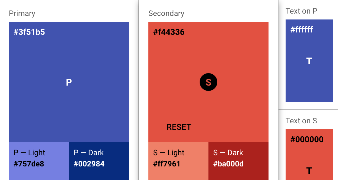
createMuiTheme() 函数可以使用此输出结果:
import { createMuiTheme } from '@material-ui/core/styles';

const theme = createMuiTheme({
  palette: {
    primary: {
      light: '#757ce8',
      main: '#3f50b5',
      dark: '#002884',
      contrastText: '#fff',
    },
    secondary: {
      light: '#ff7961',
      main: '#f44336',
      dark: '#ba000d',
      contrastText: '#000',
    },
  },
});
社区提供的一些工具
- create-mui-theme: 使用 Material Design 颜色工具来创建 Material-UI 主题的在线工具。
- material-ui-theme-editor:只需要选择颜色即可为你的 Material-UI 应用生成主题的工具,同时还支持在线预览。
- Material palette generator:它可用于通过您输入的任何颜色生成一系列的调色板。